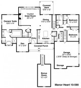
Let’s face it. When we sit down and look at a floor plan for our dream home, it’s easy to just think what’s in the design is the best solution. After all, a professional designer was behind the ideas so everything has to be the way it should be. So who needs to second-guess the plan?
“But here’s the thing: You tour homes. You look at floor plans and view room layouts,” said Rick McAlexander, CEO of Associated Designs in Eugene, Ore. “What you see may not be the ideal way the room should be put together or the right way to plan where each room goes. You have to evaluate how it all fits together, and then be sure it’s right for you.”
Knowing how to study floor plans and what to look for in a home design can help you figure out what’s good and bad, what works and what doesn’t. Sounds daunting, but lest you think you’re on your own, we’ve got you covered. Here are four tips and tricks to help you review floor plans like a professional home designer.
Movement Matters
A home needs to have an easy flow – and by that we mean there has to be a reason for a wall to be where it is. Similarly, a home shouldn’t have dead ends. The reason is simple: movement matters.
“Natural flow can be as simple as counting how many steps between the kitchen and dining room,” said McAlexander. “If the dining room is a fair distance from the kitchen, there’s something wrong with the home design. How you move from room to room, and move within a room, matters.”
In other words, when looking at a floor plan, try to envision moving through the design. A house with a great room, for example, should have all the essential gathering spaces connected: living room, dining room, and kitchen. If a wall or fireplace blocks the movement between rooms, then it’s not really a great room.
A good rule of thumb in this case is to compare the new home with your current home. Are there elements of your existing home that you like or don’t like? If that utility room in your current house is in the perfect spot – right next to the garage and yet out of sight – then be sure the home you’re considering has a similar setup.
Outdoor Living
Not everyone thinks to consider the outdoor space in a home design. But a living space isn’t limited to the living room. When you entertain friends and family, you use the living room, dining room, kitchen, and even the backyard. If there’s a patio or a porch, they have to be built with functionality in mind.
For example, let’s say you decide to tour a beautiful country cottage with a cute front porch and a backyard patio with pergola for soft shade. The backyard patio has ample space with plenty of room for outdoor furniture, a grill, and maybe a few well-placed potted plants. In your mind’s eye, you can picture fun summer barbecues with yard games.
In comparison, the front porch is small and simple. Granted, it has curb appeal but other than that, it serves no function. A porch that can be a useful living space needs to be at least 8-feet deep. But the space in this design is not large enough for patio furniture let alone a party, so you are left with a front porch that isn’t a porch at all.
“Take time to consider how much outdoor living space you will need,” said McAlexander. “In most cases, if there’s something about your current home’s outdoor area that you like, be sure your new home has those same qualities. You want to have an equally comfortable exterior when compared to the interior.”
Natural Light
This is a home design tip that is as important as the size of your kitchen. A home without ample light can be a cave – dark, dreary, and unpleasant. Each room in a home needs to have windows because natural light can make all the difference in how your home feels.
“Let’s compare it to a medieval castle,” said McAlexander. “A castle has great spaces and lots of room, but the windows are small and limited. Each room becomes a cave when the sun goes down. A home you’re touring shouldn’t have rooms that make you feel like you are in a cave. Yes, you want ample space but you also want ample natural light.”
Insufficient daylight is usually the result of too few windows, or windows on only one wall. A great room similarly needs to have large windows or it will be a not-so-great room. Natural light adds depth and power to a home, so when you study a floor plan or tour a home, don’t forget to look out the windows.
Labeled Spaces
This final tip to studying floor plans is all about flexibility. Many floor plans online have labeled spaces telling you where the kitchen is or what this room near the dining room is supposed to be. The labels are there to offer some insight into how the designer saw the space being used. But spaces aren’t limited to what the label says.
In other words, don’t be trapped by labels. If you need a home office, and the floor plan includes a space labeled “formal dining room” that you won’t use, then turn it into what you need. A space can serve more than one purpose.
“Remember that the home you are touring or the floor plan you are looking at is open to interpretation, specifically your interpretation,” said McAlexander. “You can decide how that extra room should be used.”


